Deviation Actions
Description
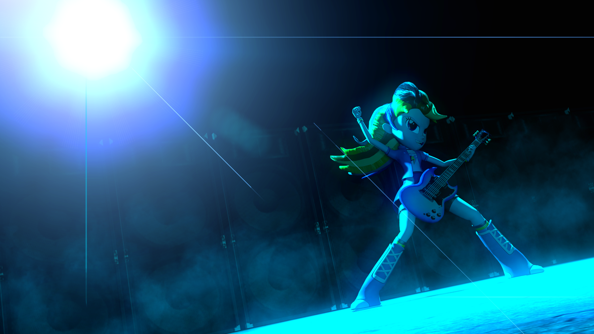
Not sure if I'm gonna create more images on a regular basis, but I basically forced myself to create one. I thought it'd be a struggle, but it was actually quite easy and everything came back to me.
Hi, I've been learning quite a lot from your works and have personally tried to imitate them into my own, so this is not going to be easy for me to write. I can't write a good or fair critique because I don't even have the knowledge or expertise on creating a good gmod art, but I can give my personal 'gut feeling' opinion, so...take it with a grain of salt.
I've seen your works and I gotta say this isn't your best--I mean, compared to your other works like Lounging, Speed Derp and Swim, this one just looks bland.My ratings explanation:
- Vision: 5/5 any vision that drives a person to create art is always good
- Originality 3/5 there's nothing original about RD on stage with her guitar being awesome. It's not a slight against the picture, mind you. Derivative works can be as great as original ones.
- Technique4/5 I deduce points mostly on the editing side, which I'll get into detail later.
- Impact4/5 overall it's alright, but could have been more. I don't feel strongly about it.
On the positive side, there is nothing wrong with the posing. Dash's expression is easy to understand and she looks to be firmly placed on the ground i.e. she's neither floaty nor awkward and that's great. Also, the 'mist' effect is a really nice touch.
Here's what I think needs improvement; my 'problems' with the picture are:
- It's BLUE everywhere! There is no other color present. Perhaps you were going for a 'blue' theme, but this is just like looking through a blue tinted glasses.
- There's nothing on the picture. I can faintly see the row of loudspeakers on the background but they're so faint and blended with the black backdrop that it became less interesting to see.
- The lens flare lines, I mean...there's even one line that, if you extend it, it wouldn't even touch the light source.
The use of negative space and the way the picture is composed, may suggest an emphasis on Rainbow Dash. However it usually works when the foreground can be clearly separated from the background and the main subject is different enough from other objects in the picture. But because everything in the picture is in the same shade of blue, Rainbow Dash just doesn't 'pop' like she's meant to, instead she melts away into the background. Overall, the picture could have been more interesting without the overpowering blue tint.
I thank you for reading this far, I hope this has been fair or helpful. If not, I apologize for taking your time. Anyway, I enjoy your works and hope you keep on making stuff.


![[DL] Flash Sentry (Colt version)](https://images-wixmp-ed30a86b8c4ca887773594c2.wixmp.com/f/23f744ca-8fe4-404d-a433-5ba93cbe5c8f/d9t43ch-cc7e1e20-8c3e-470b-9ca1-fa492a47eaa0.png/v1/crop/w_184)
![[DL] EG: Derpy Hooves](https://images-wixmp-ed30a86b8c4ca887773594c2.wixmp.com/f/23f744ca-8fe4-404d-a433-5ba93cbe5c8f/d9e3ii7-8a3260ac-9f34-4873-a667-c8c8cf5f5bb7.png/v1/crop/w_184)
![[DL] Equestria Girls Rainbooms musical instruments](https://images-wixmp-ed30a86b8c4ca887773594c2.wixmp.com/f/23f744ca-8fe4-404d-a433-5ba93cbe5c8f/dalocew-236ac374-05d9-487d-b4ce-aa71ea8c0a78.png/v1/crop/w_184)


![Twixie [Request] Release](https://images-wixmp-ed30a86b8c4ca887773594c2.wixmp.com/f/948ca84a-7e37-4660-8d28-685ce786f589/da86qvs-5e452147-5882-4f6b-8270-fd3912526f55.jpg/v1/crop/w_184)


